

Undertone first: the real rule behind lingerie colour choices for skin tones
Match your lingerie undertone to your skin undertone first. Depth (how fair or deep your skin is) matters, but undertone is what actually makes a “nude” piece disappear under clothing. Get the undertone right and a shade a few tones off in depth will still read as invisible; get it wrong and even a perfect depth match will look chalky, pink, or grey against your skin.
You can work out your undertone in under a minute with three checks stylists rely on:
- Jewellery test: gold looks better against warm undertones, silver against cool, and if both look equally good, you’re likely neutral.
- Vein test: check the inside of your wrist in natural light. Greenish veins point to warm, blue or purple veins point to cool.
- White cloth test: hold something plain white against your face. Skin that looks sallow or yellow beside it usually reads warm; skin that looks pink or rosy usually reads cool.
Once you know your undertone, shopping gets far easier. Lingerie Seduction stocks pieces across a genuine spread of nude and skin-adjacent tones rather than a single “beige,” and the picking the right lingerie colour for your skin tone guide is a good place to see how that plays out across real product photos.
Key Takeaways
Undertone match, not depth match, is what makes lingerie disappear under clothing, and it holds true across every skin depth from fair to deep.
| Point | Details |
|---|---|
| Undertone beats depth | A close undertone match hides better than an exact depth match in the wrong undertone family. |
| Three quick tests confirm undertone | Jewellery, vein, and white cloth tests together reliably sort skin into warm, cool, or neutral. |
| Undertone doesn’t shift with tanning | Depth changes with a tan; the warm, cool, or neutral cast underneath stays the same year round. |
| Lighting changes perceived colour | Judge shade matches in natural daylight, not warm bathroom light or cool retail fluorescents. |
| Lingerie Seduction offers real shade range | Pieces like the Sheer Peach Floral Lace Lingerie Set and Black & Nude Sheer Stockings give practical undertone-led starting points, backed by free shipping over $100 and hassle-free returns. |
Table of Contents
- How to identify your skin undertone using simple at‑home tests
- Colour map: flattering lingerie shades by undertone and skin depth
- How to pick a ‘nude’ bra that disappears under clothing
- When to choose contrast or bold colour instead of matching nude
- Shopping checklist: fit, fabric, lighting, exchange policies and care
- Examples from Lingerie Seduction’s catalogue that illustrate undertone-led choices
- Consideration of seasonal colour palettes for Australian skin tones
- The influence of lighting conditions on lingerie colour appearance
- The impact of personal style and occasion on lingerie colour choice
- Why “one nude for everyone” was always the wrong idea
- Shop nude and statement shades built for real skin tones
- Sources
- FAQ
How to identify your skin undertone using simple at‑home tests
Undertone identification is not guesswork if you use the right checks, and stylists have leaned on the same three for years because they hold up regardless of how tanned or pale you are at any given moment.
- Do the jewellery test first. Hold a gold piece and a silver piece against your inner arm in daylight. Gold that makes your skin look richer signals warm undertones; silver that looks crisper against your skin signals cool. If you genuinely cannot tell the difference, you’re probably neutral, which is common and gives you more colour flexibility than you might think.
- Follow with the vein test. Look at the veins on the inside of your wrist under natural light, not a bathroom globe. Green veins mean warm, blue or purple veins mean cool, and a mix of both usually means neutral.
- Confirm with the white cloth test. Hold a plain white t-shirt, pillowcase, or sheet of paper next to your face. Skin that looks yellow, golden, or slightly olive against white is warm. Skin that looks pink, red, or slightly blue is cool.
Stylists commonly recommend these three checks together because no single test is foolproof on its own, but agreement across two or three reliably points to warm, cool, or neutral.
Photograph yourself in natural window light, not overhead artificial light, if you want a second opinion later. Phone cameras adjust white balance automatically indoors, which can shift your skin a full undertone category in the photo.
One thing that trips people up: undertone doesn’t change when you tan. Your skin gets deeper, but the warm, cool, or neutral cast underneath stays fixed. If a “nude” bra worked for you in winter, the same undertone will still work in summer, even though your ideal depth of nude might shift a shade or two.
Pro Tip: Do the vein and white cloth tests on a day with no makeup and no fake tan. Both can subtly shift how your skin reads, especially warm-toned self-tanners, which push almost everyone toward a warmer reading than they actually have.
Colour map: flattering lingerie shades by undertone and skin depth
Undertone-matching is the single biggest lever in whether lingerie reads as invisible or “off,” which is exactly why stylist-built colour tables cross-reference undertone with depth rather than offering one nude for everyone. Below is a working map you can screenshot and take shopping.
Warm undertones (golden, peachy, or olive cast)
- Fair warm: honey beige, warm ivory, soft peach, apricot.
- Medium warm: caramel, terracotta, warm rose, honey brown.
- Deep warm: espresso, chestnut, deep amber, warm mahogany.
- Universal warm “nude” candidates: warm sand and caramel sit close to skin across most of this range, which is why they show up repeatedly in inclusive shade charts.
Cool undertones (pink, red, or blue cast)
- Fair cool: soft rose, cool ivory, blush pink, lilac grey.
- Medium cool: dusty rose, mauve, cool taupe, plum grey.
- Deep cool: deep berry, cool espresso, blackened plum, charcoal rose.
- Universal cool “nude” candidates: taupe and cool-toned dusty rose tend to sit closest to skin without the yellow cast that makes warm nudes look grey on cool skin.
Neutral undertones (a genuine mix, no strong pink or gold)
- Fair neutral: oatmeal, soft champagne, dove grey, pale nude pink.
- Medium neutral: latte, sandstone, dusty mauve, warm greige.
- Deep neutral: deep cocoa, bronze, cool-warm balanced espresso.
- Universal neutral “nude” candidates: sandstone and deep cocoa flex both warm and cool without tipping fully into either, which gives neutral-undertone shoppers the widest realistic range to choose from.
The market has historically underserved the ends of this spectrum. Editorial roundups on inclusive lingerie note that mainstream ranges once offered only one or two pale-beige “nudes” and that newer brands have since expanded well beyond that, which is worth knowing if you’ve previously been told there was nothing suited to your depth.
Beyond nude, certain colours flatter almost every undertone once you know the right family to reach for. Warm undertones tend to glow in jewel tones with a golden base: amber, burnt orange, deep teal. Cool undertones tend to come alive in jewel tones with a blue base: sapphire, emerald, true red, deep violet. Neutral undertones can usually wear either family, which is genuinely one of the few advantages of sitting in the middle. None of this is about avoiding your favourite colour. It’s about knowing which version of that colour, warmer or cooler, sits best against your particular skin.
How to pick a ‘nude’ bra that disappears under clothing
The goal with a nude bra is invisibility, and undertone compatibility does more of that work than an exact depth match ever will. A bra that’s a shade lighter or darker than your skin but shares your undertone will still blend far better than a “perfect” depth match in the wrong undertone family, because nude is fundamentally relational, not absolute.
Fabric and finish matter almost as much as colour. Matte, low-sheen fabrics disappear better than satin or anything with a glossy finish, which catches light and draws the eye exactly where you don’t want it. Seamless cups and spacer foam (a moulded foam that has no visible seam lines) reduce the telltale ridges that show through fitted tops even when the colour is spot on.
Before you commit to a purchase, run three quick checks:
- Hold the garment against your bare skin in daylight, not under shop lighting or a phone flash, and look at where the fabric edge meets your skin.
- Photograph it against your skin and check the photo later, since cameras sometimes reveal a colour clash your eye glosses over in the moment.
- Try it under the actual outfit you plan to wear it with, particularly if that top or dress is thin, pale, or clingy.
If no shade in a range matches your undertone closely, a close undertone match still beats a closer depth match for reducing visibility. At the very fair or very deep ends of the spectrum, where a perfect pigment match may not exist in every range, tonal layering is your best fallback: pick a thong or bodysuit in the closest undertone you can find rather than compromising on undertone to chase an exact depth.
When to choose contrast or bold colour instead of matching nude
Not every occasion calls for invisibility, and colour can do a lot of the emotional work in lingerie once you stop treating “nude” as the default. Contrast is the better choice when you’re dressing for the lingerie itself, not for concealment under clothes: date nights, anniversaries, boudoir photos, or simply when you want to feel bold rather than blended in.
Safe, flattering contrast picks by undertone:
- Warm undertones: deep red, burnt orange, emerald, chocolate brown.
- Cool undertones: sapphire blue, plum, fuchsia, true black.
- Neutral undertones: either family works, though jewel tones with a slightly muted base tend to read as more sophisticated than very bright, saturated shades.
Black and white sit outside the undertone rules entirely, which is why they’re the two most reliably purchased colours in lingerie. Black reads as universally flattering because it doesn’t compete with skin tone at all, it simply frames it. White does the opposite and can wash out very fair or very deep skin under strong lighting, so it’s worth trying under the same lighting you’ll actually wear it in before you commit.
Shopping checklist: fit, fabric, lighting, exchange policies and care
A wrong-shade order is often really a wrong-fit order in disguise, so work through fit before you second-guess the colour.
- Check your measurements against the size chart first. A bra sitting wrong on the band or cup can make even a correctly matched nude look patchy or uneven, which reads as a colour problem when it isn’t one.
- Look for photos in natural light on the product page, or request a swatch description if the listing only shows studio lighting, which can shift warm tones cooler and cool tones warmer.
- Confirm the returns and exchange policy before you buy, specifically whether shade mismatches qualify for exchange rather than only faults. This is standard advice from inclusive lingerie retailers precisely because colour perception varies so much screen to screen.
- Note the shipping terms. Lingerie Seduction offers free shipping on orders over $100 and hassle-free returns, which takes some of the risk out of trying a new undertone family for the first time.
- Care for the piece properly once it arrives. Hand wash in cold water and air dry away from direct sun, since heat and UV are what fade nude tones fastest and turn a good match into a poor one within a few washes.
Examples from Lingerie Seduction’s catalogue that illustrate undertone-led choices
Theory only helps once you can see it applied to real pieces, so here’s how three items in the Lingerie Seduction range map onto the undertone logic above.
- The Erotic Open Cup Bra & Garter Panty Set is built as a statement piece rather than an invisible layer, making it a strong pick for the “choose contrast deliberately” scenario covered earlier, romantic nights where the lingerie is meant to be seen, not hidden.
- The Sheer Peach Floral Lace Lingerie Set sits in the warm-to-neutral peach family, a genuine option for warm and neutral undertones seeking a soft, romantic colour that still reads close to skin rather than starkly contrasting.
- The Black & Nude Sheer Stockings For Garters pair a universal black with a nude sheer panel, a practical way to test how a sheer nude tone reads against your own leg tone before committing to nude in other garment types.
All three ship with discreet packaging and fast local dispatch, and orders over $100 qualify for free shipping with hassle-free returns if a shade doesn’t sit right once it arrives. Trying one product against your own undertone tests, rather than guessing from a product photo alone, is the fastest way to confirm whether the map above holds true for your specific skin.
| Product | Best suited to |
|---|---|
| Erotic Open Cup Bra & Garter Panty Set | Statement/contrast occasions, any undertone |
| Sheer Peach Floral Lace Lingerie Set | Warm to neutral undertones wanting a soft romantic tone |
| Black & Nude Sheer Stockings For Garters | Testing sheer nude against leg tone; universal black base |
Consideration of seasonal colour palettes for Australian skin tones
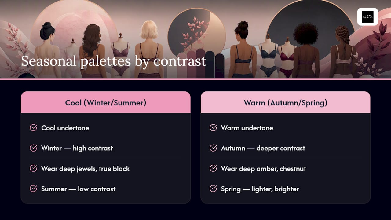
Seasonal colour analysis, the styling framework that sorts people into “winter,” “summer,” “autumn,” or “spring” palettes, maps loosely onto undertone but adds a depth and contrast dimension worth knowing before you shop by season alone.
“Winter” and “summer” palettes generally suit cool undertones, but they differ in contrast: winters typically carry higher contrast between skin and hair, which means they can wear very deep jewel tones or true black in lingerie without it overwhelming them. Summers usually have softer, lower contrast colouring, so muted cool tones like dusty rose or soft lilac tend to sit better than stark black or bright fuchsia.
“Autumn” and “spring” palettes generally suit warm undertones, again split by contrast. Autumns carry richer, deeper colouring and can wear deep amber, chestnut, or burnt orange lingerie comfortably. Springs tend to be lighter and brighter, so warm peach, coral, or honey beige reads better than the deeper autumn shades.
Australia’s climate means a lot of people move between deeper and lighter versions of their season across the year as tanning changes their depth, without ever changing their underlying undertone or season. If you’ve worked out you’re a summer, for instance, staying in the cool, muted colour family while adjusting depth to match your current tan is more useful than switching undertone families altogether.
The influence of lighting conditions on lingerie colour appearance
Lighting changes what colour you’re actually looking at, which is why the same “nude” bra can look like a perfect match in a fitting room and slightly off once you get it home.
Warm artificial light, the kind most bathrooms and bedrooms use, pushes every colour warmer and can make a cool-undertone nude look faded or ashy. Cool fluorescent lighting, common in some retail changing rooms, does the opposite: it can make warm nudes look sallow or grey against skin that actually suits them perfectly well in daylight.
Natural daylight, ideally indirect light near a window rather than direct sun, is the most reliable condition for judging whether a colour truly matches your undertone. This is exactly why the shopping checklist earlier recommends checking product photos taken in natural light rather than trusting studio shots alone.
Screen colour is its own variable. Phone and laptop screens render colour differently depending on brightness settings and screen technology, so a nude that looks slightly pink on your phone might read as neutral beige on a laptop. If a shade decision is close, it’s worth viewing the product photo on two different devices before you commit, and checking it again against your skin once it arrives in daylight rather than assuming the online photo told the full story.
The impact of personal style and occasion on lingerie colour choice
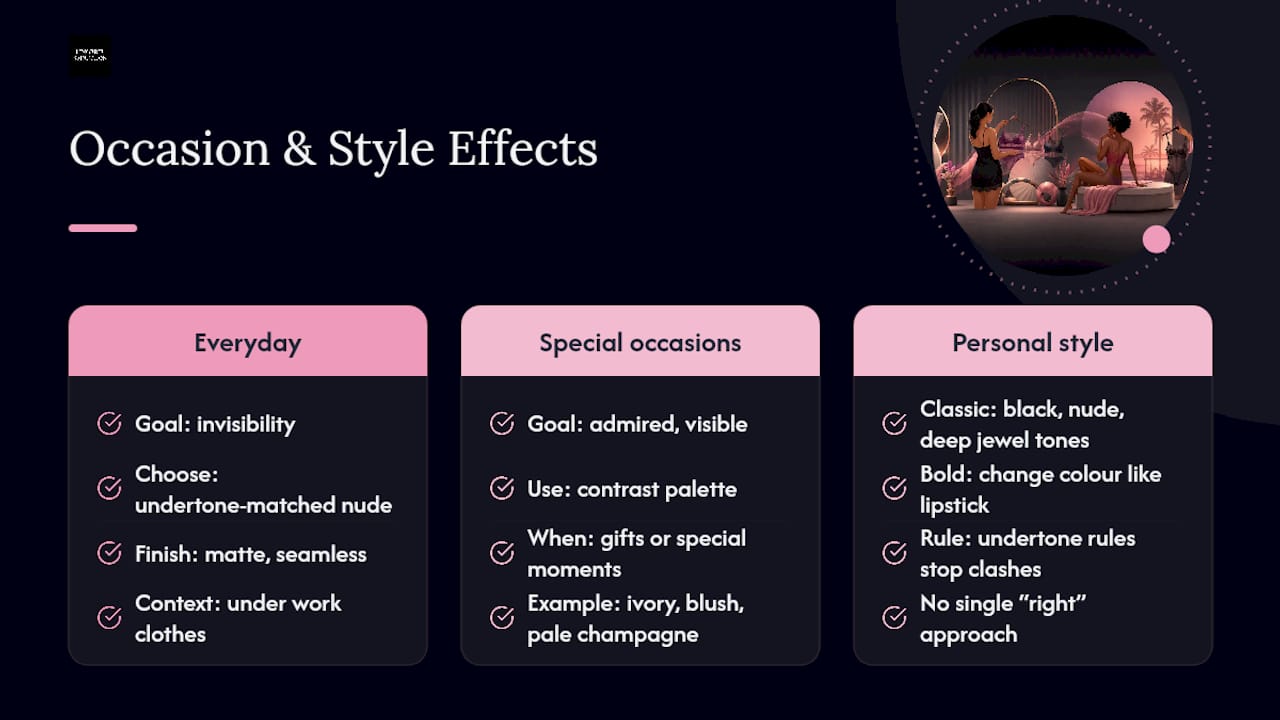
Undertone tells you what will disappear or flatter. Occasion tells you whether disappearing is even the goal, and that distinction matters more than most colour guides let on.
For everyday wear under work clothes, invisibility usually wins, so undertone-matched nude in a matte, seamless finish is the practical default. For special occasions, gifts, or moments where the lingerie is meant to be admired rather than hidden, colour becomes a styling choice in its own right, and the contrast palette covered earlier gets far more useful than any nude chart.
Personal style plays into this too. Someone who gravitates toward classic, minimal dressing might lean on black, nude, and deep jewel tones across every occasion, while someone with a bolder personal style might treat lingerie colour the same way they’d treat a lipstick shade, changing it based on mood rather than sticking to one “correct” palette. Neither approach is more right than the other. The undertone rules in this guide are there to stop a colour from working against your skin, not to dictate which colours you’re allowed to enjoy wearing.
Bridal shopping is a useful example of occasion overriding the default nude instinct: many brides choose ivory, blush, or pale champagne specifically because it complements a wedding dress colour, not because it’s their most undertone-flattering shade. That’s a legitimate choice as long as it’s made knowingly rather than by accident.
Why “one nude for everyone” was always the wrong idea
The lingerie industry sold “nude” as a fixed pale beige for decades, and that framing never matched how skin actually works. Undertone, not surface depth, decides whether a garment reads as skin or as a garment, and that’s a distinction most colour guides still gloss over in favour of simple fair-medium-deep charts.
What the conventional advice gets wrong is treating depth as the whole story. A medium-depth shopper with a cool undertone who buys a “medium” nude built on a warm base will still see visible edges under a white shirt, no matter how well the depth lines up on paper. The undertone test takes thirty seconds and prevents that mistake entirely, yet it’s routinely skipped in favour of picking whatever’s labelled closest to your general skin colour.
If you take one thing from this guide, prioritise the vein and white cloth tests before you open a single product page. Depth can be adjusted with layering or a slightly lighter or darker choice within your undertone family. Undertone itself cannot be fudged, and getting it right the first time saves you the frustration of a return.
— Lingerie Seduction
Shop nude and statement shades built for real skin tones
Lingerie Seduction stocks nude, blush, and skin-adjacent shades across genuinely different undertone families, not one beige stretched to fit everyone, which is the exact gap this guide has been pointing at. That means you can shop by undertone rather than settling for whichever “nude” happens to be in stock.
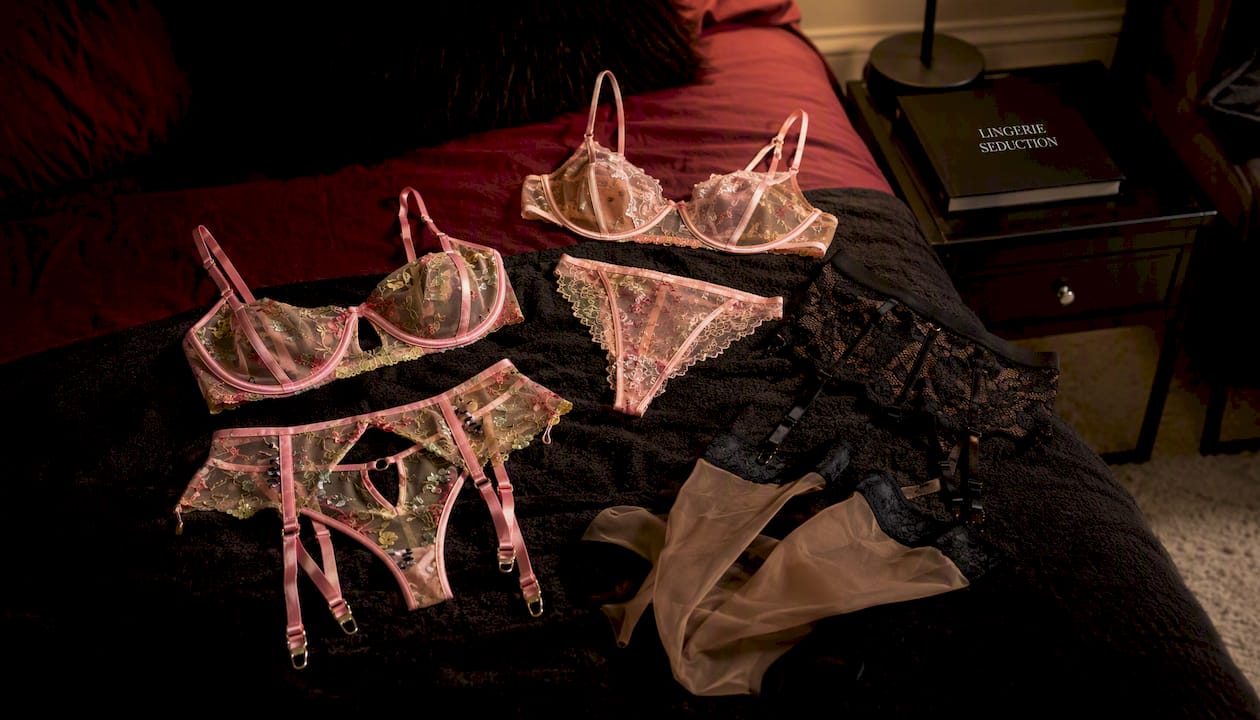
If you’ve just worked out you’re warm-undertoned with a medium depth, the Sheer Peach Floral Lace Lingerie Set is a genuine starting point rather than a guess. If you’re testing how a sheer nude panel sits against your own leg tone, the Black & Nude Sheer Stockings For Garters let you check that without committing to a full set. And for the occasions where invisibility isn’t the goal at all, the Erotic Open Cup Bra & Garter Panty Set is built to be noticed, not blended in.
Every order over $100 ships free, returns are hassle-free if a shade doesn’t land the way you expected, and packaging arrives discreet every time. Browse the full lingerie colour guide and pick your first undertone-matched piece today.
Sources
- Nude bras for every undertone in bigger sizes: How to find your match - Parfait Lingerie blog
- These 13 inclusive lingerie brands are making nude bras for all - Refinery29 (AU)
- How to choose lingerie colors that flatter your skin tone - Swoon Pops
- Nude lingerie for every skin tone - Who What Wear
FAQ
What colours should I wear based on skin tone?
Warm undertones generally suit golden, peachy, and amber-based colours, cool undertones suit rose, blue, and true-based colours, and neutral undertones can wear either family. Depth (fair, medium, or deep) then fine-tunes how light or dark the specific shade should sit within that family.
What colour bra shows the least under clothing?
A bra that matches your undertone, not necessarily your exact depth, shows the least under clothing, paired with a matte, seamless finish rather than satin or lace overlay. Undertone-matched nude in the right fabric consistently outperforms a “perfect” depth match in the wrong undertone family.
Which colour bra attracts men?
There’s no single colour with universal appeal, since preference varies person to person, but black is the most consistently purchased and widely liked colour in lingerie because it flatters every undertone equally. Beyond that, personal style and occasion matter more than any single colour choice.
Does my undertone change if I get a tan?
No. Tanning changes your skin’s depth but not its underlying warm, cool, or neutral undertone, so a nude shade that matched you before will still match once your depth shifts. Only your ideal depth of nude may need adjusting across seasons.
What if my exact skin tone isn’t available in a range?
Prioritise the closest undertone match over the closest depth match, since undertone does more work in reducing visibility than exact pigment matching. At the very fair or very deep ends of the spectrum, tonal layering, choosing accessories like a thong or bodysuit in the same undertone family, is a practical fallback.
Recommended
- Picking the Right Lingerie Colour for Your Skin Tone – Lingerie Seduction
- What Colour Lingerie Should I Wear? The Ultimate Guide to Finding Your – Lingerie Seduction
- How to select lingerie for your mood: 2026 guide – Lingerie Seduction
- Mix and match lingerie pieces like a stylist, not a shopper – Lingerie Seduction


